Last week I bought this gorgeous Braxton Payne fireplace on eBay. It’s a limited edition from a 2007 convention in Fresno and the auction said it was half scale. I love Braxon’s fireplaces and own a few — including the Southwestern beehive fireplace in my quirky Spanish Revival artist’s cottage — but I’d never seen this one before and I couldn’t pass it up. I snagged it for $28 with Buy It Now (which is comparable to the prices on his website).
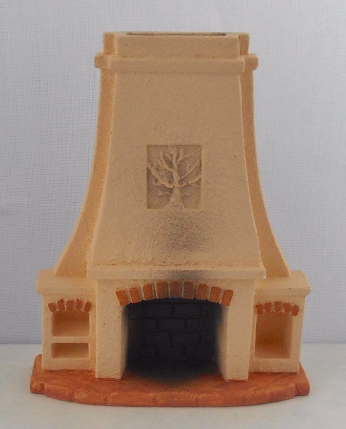
I’m usually careful not to buy miniatures online without knowing the dimensions or at least seeing a ruler in the photo. In the seconds before I hit the “buy” button it occurred to me that this might not really be half scale, but I didn’t want to risk missing out on it by asking the seller for dimensions and having someone else buy it while I waited for the answer. What were the chances it wouldn’t really be half scale?
100%, apparently.
I didn’t try to return it or even mention the error to the seller, because I still love this little fireplace. I’ve never done quarter scale before but I do have a Villa kit (now retired) in my stash that’s been waiting about 12 years for me to work up the nerve to build it. That house has a Spanish feel and I think this fireplace could look good in it. So I’ll hold onto the quarter scale fireplace, and gaze lovingly at it every now and then…
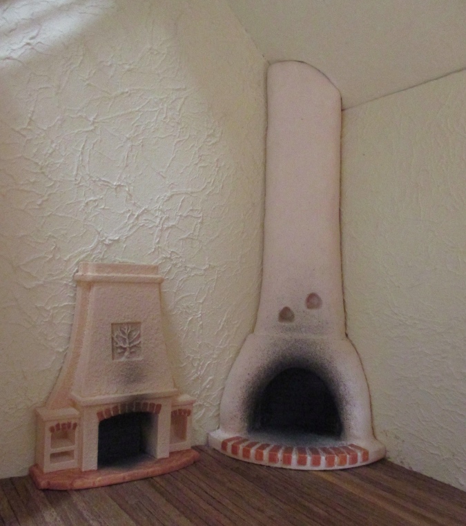
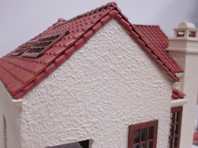
The fireplace mishap got me thinking about the artist’s cottage again. Even after I fixed the roof to the best of my ability, I had a hard time deciding on a trim that worked for the eaves. Initially I used stained half-round left over from the Little House in the Big Woods cabin.
That just wasn’t right. I pulled it off and replaced it with some of the chair rail trim I often use for half scale baseboards, painted to match the house. It was better, but still kind of funky.
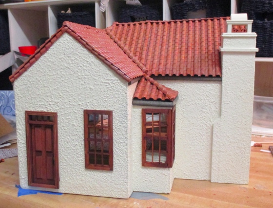
After looking at a lot of pictures and real life roofs (we have an abundance of these in Northern California!), I decided to try again with cornice. This is Classics “small cornice” (#70272), and it’s been out of stock for months at every mini shop I tried. I had a piece in my stash that turned out to be just long enough.
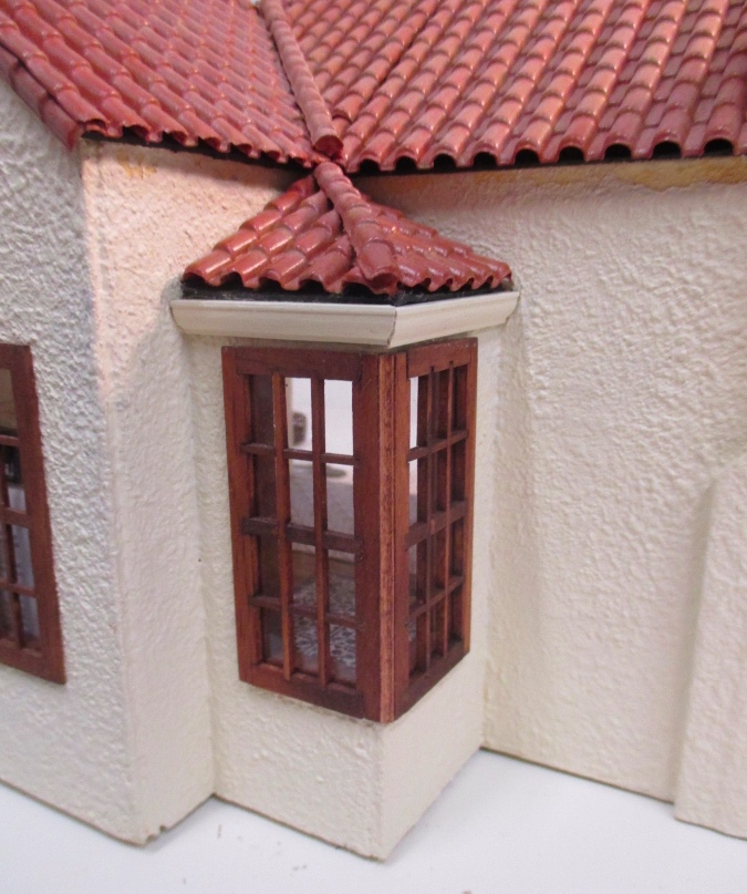
On most of the roof sections, the tiles hang over the black matboard I used for the roof so it kind of looks like a shadow. This isn’t true on the roof over the bump-out window, and I didn’t like how obvious that black edge looked. I added some skinny trim (leftover window mullions) to the top edge of the cornice, to hide the black edge of the matboard. This also helped me mask that the roof was a bit crooked on one side of the bump-out.
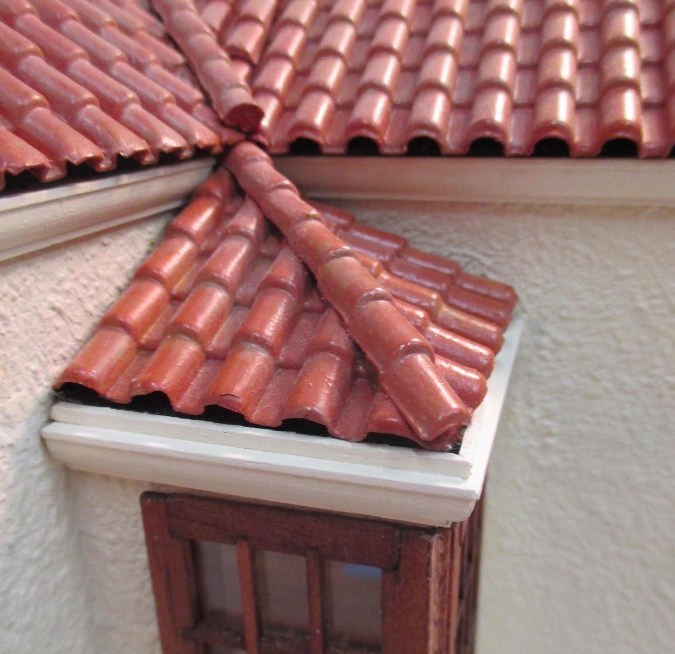
I think this looks much better than either of the other two attempts.
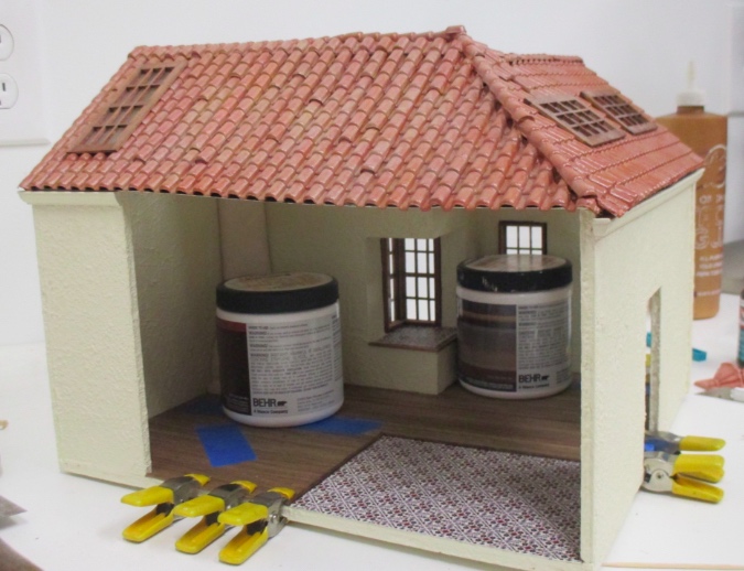
(The flooring had started pulling up, so I removed some of it and applied new glue — hence the clamps and paint jars weighting it down in the pic below.)
I mitered the corners so they barely wrap around. I like that it looks like a gutter. Maybe I’ll add a drainpipe somewhere.
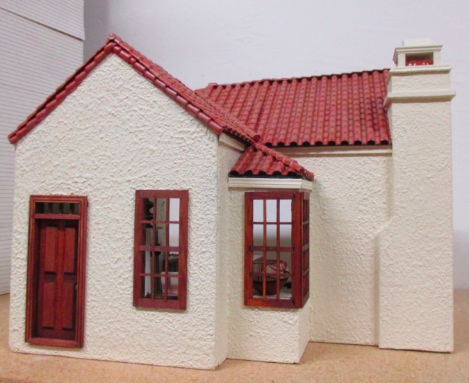
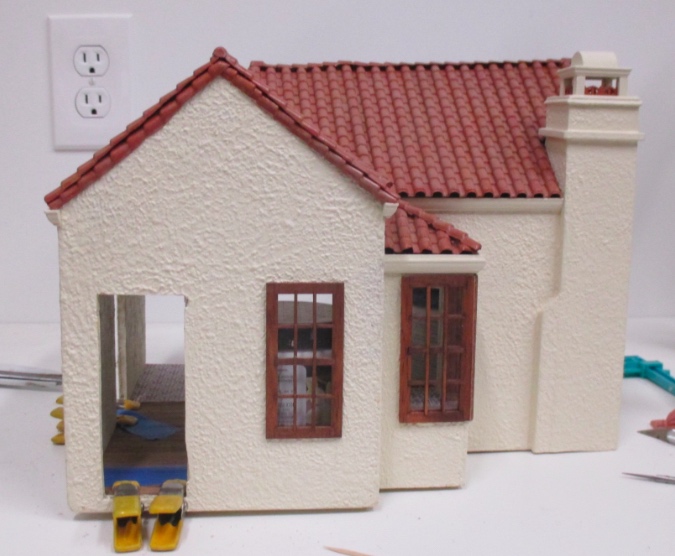
Moving on! The trim isn’t even the subject of this blog. There are two big things left to do on this little house: the side addition and the sleeping loft. Both are in progress but the loft’s waiting on something to show up in the mail, so let’s start with the addition.
 When I bought this house as a gatorboard shell (for $2!), it had a side doorway that led to nowhere. I bought a Petite Properties lean-to greenhouse kit intending to create an addition to hold either a kitchen or a bedroom. Eventually I got the idea to make the one-room house into a “tiny house” with an efficiency kitchen and sleeping loft, with the addition becoming an artist’s studio.
The greenhouse is made of thick card, with window acetate wedged between two card pieces. Since the front of the addition will be close to the front door of the house, I wanted to swap the walls and put the door at the back of the addition. This meant building the house inside out, with the pre-scored brick on the inside.
I started by doing wood filler stucco on the insides of the pieces, which covered up the bricks. I left the edges around the window openings alone so I could add stained wood trim around them to match the windows on the rest of the house.

Next I painted the stuccoed areas. For now I only did this on the inside pieces, saving the outsides for once the structure was assembled. This wood filler (Plastic Wood by Dap) isn’t the same stuff I used to stucco the outside of the house, and the texture turned out different. For the inside that’s okay — it’s more like plaster — but I might need to get some more Elmer’s wood filler before I do the outside.
The laser-cut cardstock has yellowish edges. I ran a stain pen around the insides of the window openings so this would blend in better with the stained trim. (A brown or black marker would have worked too.)

I assembled the roof the way you’re supposed to — by sandwiching acetate in between the two pieces. The acetate that came with the kit seemed a bit flimsy so I replaced it with some I had that’s thicker.

For the rest of the pieces, I glued the acetate to the inside but did not add the second piece of card that sandwiches the plastic in place. I didn’t want the walls to have a frame like the finished model does around the brick area.

Next I added wood trim to the roof.


And to the center wall. I didn’t do the left and right walls yet since they butt up against the center wall, which will impact the dimensions of the trim.

For the floor, I used some square terracotta tiles I had left over from my very first dollhouse. (Never throw anything away!)

At the edge I used loose bricks (also leftover from that first house) cut in half. They’re not quite the right dimension but they get the job done.

I glued them down, then added grout.

Here’s the finished floor.

I filled in the gap at the edge of the floor with strip wood painted to match the wall. I also added a thin piece of strip wood to the other long edge to account for the fact that the walls were slightly overhanging the edge of the floor (a side effect of leaving off the second piece of card, which would have made the center wall slightly thicker and pushed the floor into the correct position). Then I glued on the walls.

Obviously there’s still work to do, but I love it so far! I plan to glue the roof on, but leave the addition detached from the house so I can get in to add furniture.

I’ve had a vision in my head all this time of how the addition would look against the side wall, but I never really considered how it would change the front view of the house. It looks like it belongs there.

(But ack, that crooked roofline still makes me cringe…)
 Emily is a freelance writer, miniaturist, and adventure game enthusiast.


The addition looks perfect.
As to the roofline: It’s an old (ancient) house in a hostile desert environment and things shrink and settle over time causing roofs to go crooked. Celebrate it!
Love,
Dad
Love that addition! You are right – it looks like it really belongs there. I’ve made the equivalent greenhouse kits up in quarter scale and they give great results, but love the way you have turned yours around so the door is at the back. This little cottage has really come a long way since you started on it.