Haven’t had much time for mini-ing lately, but this week I finished a petitpoint carpet and a few weeks ago Geoff helped me cut some wood to make ceilings and knee walls for the rowhouse’s attic rooms, so here’s a hodgepodge of pictures for all of my restless readers.
The Queen Anne rowhouse has two large attic rooms that I plan to use as a bedroom and a rec room with a pool table. I wanted to add ceiling lamps but the peaked ceilings makes this tricky. And I never really like dollhouse rooms with slanted walls, they just don’t seem realistic to me. So, I wanted to cut pieces of plywood that could be used to create a flat ceiling, and a short wall.
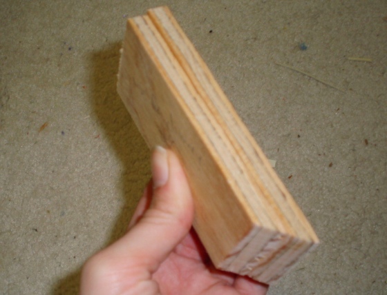
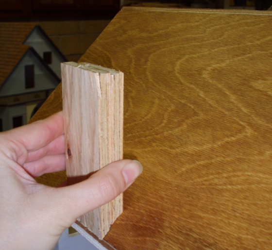
Since these pieces will meet the ceiling at a 45-degree angle, their edges need to be cut at 45-degree angles. Geoff did this for me with his table saw. (What a guy!)
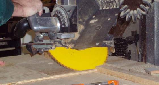
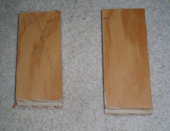
We used scrap plywood that isn’t the nicest, but it’s going to be covered up with wallpaper and ceiling paper. The house isn’t quite square so it took a few attempts to get the sizes right.
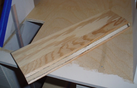
The ceiling piece is about 2-1/2 inches across and fits right into the triangular area above where the roof piece that swings opens is hinged. The wall piece is 1-7/8 tall. (I read on Wikipedia that a knee wall is usually under 3 feet tall, and these would be almost 4 feet tall. So maybe it’s not technically a knee wall.)
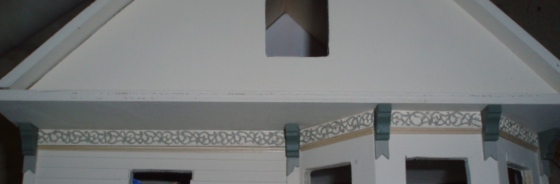
Here’s the basic idea.
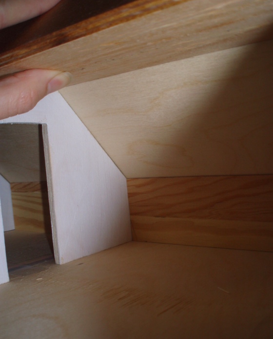
The ceiling is only truly visible if you duck and look up from underneath, or through the window. But it will make it much neater to add ceiling fixtures in here since now I can hide the wires.

 Emily is a freelance writer, miniaturist, and adventure game enthusiast.

