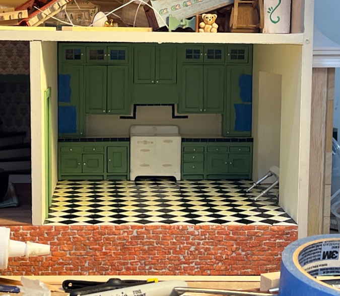
This post has been a long time coming. I’ve been puttering around on the Mansard Victorian’s kitchen backsplash ever since I finished the countertop in January.
First I glued in the kitchen wallpaper. I prepared this scrapbook paper last fall when I started the kitchen (yikes, has it been that long?) but then I put it aside because I wasn’t sure if plain white was the way to go.
But with the cabinets finished and providing a lot of color to the room, I decided the white would work. To be fair, I also didn’t feel like cutting out more wallpaper.
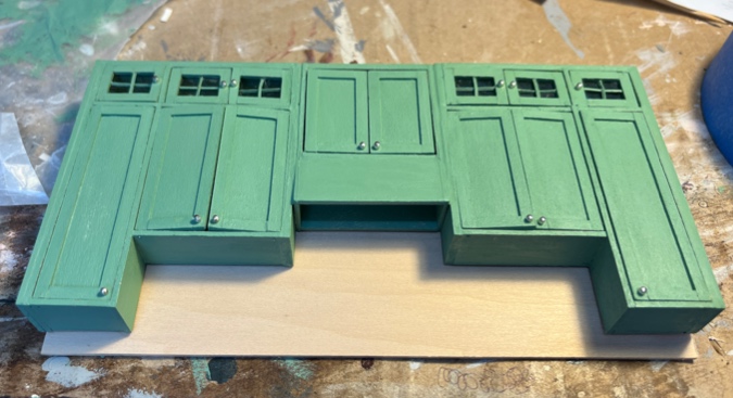
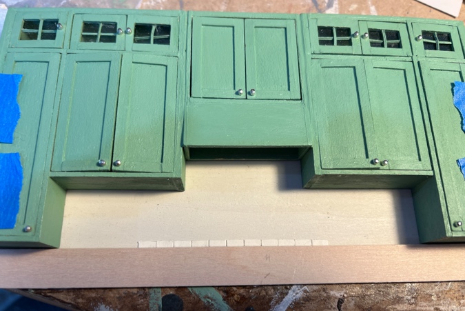
The upper cabinets were an extremely tight fit — so much so that I couldn’t get them in and out of the house in one piece. But I needed them to be one piece in order to fill in the cracks between the three units.
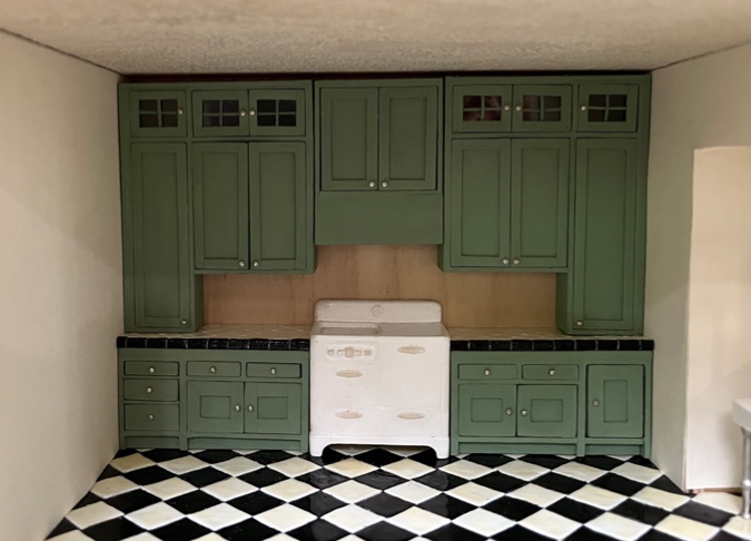
I carefully sanded the edges of the cabinets on the disc sander until I was able to glue them together and still slide them in and out of the house. In order to do this, I need to slide them in horizontally, close to the ceiling, and then ease them down the wall. I won’t be able to do this once a ceiling light and trim on the bump-out opening are installed. (Luckily I realized this before I glued those in!)
Once the cabinets were glued together, I added wood filler to the cracks, and then painted over them.
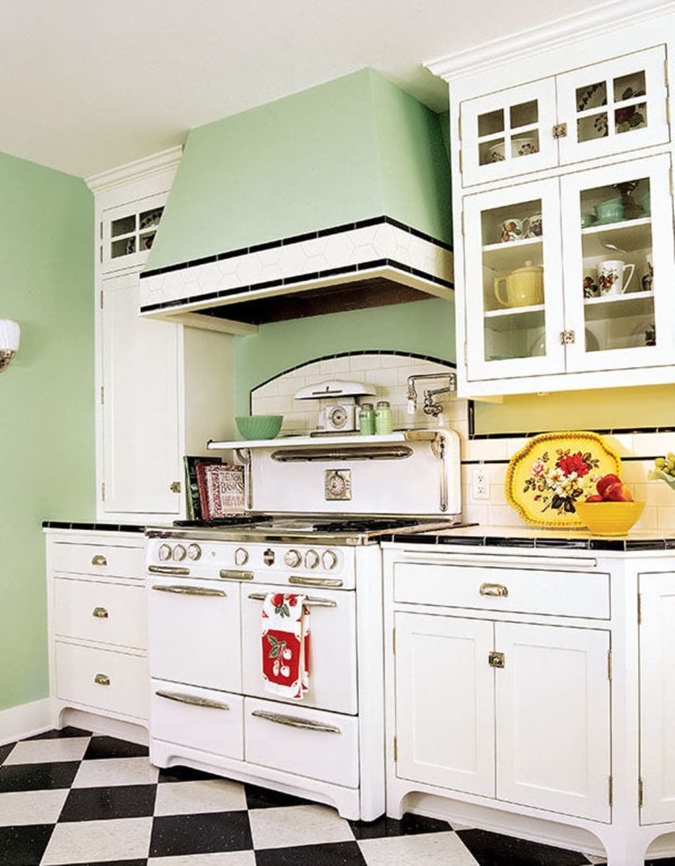
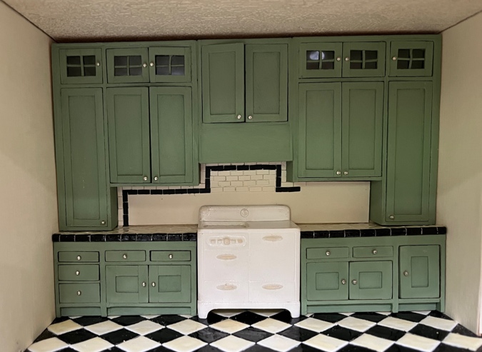
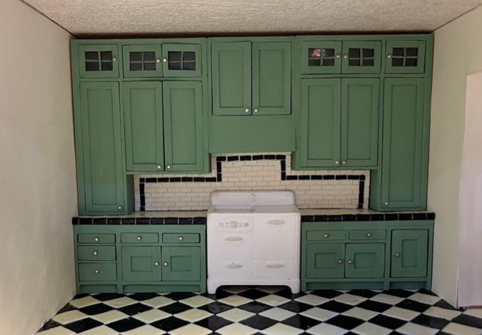
Now on to the backsplash. Like in the inspiration picture, I envisioned a white subway tile backsplash with black trim.
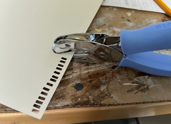
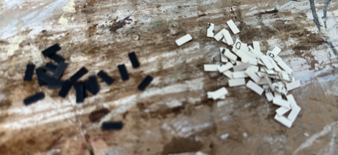
This Fiskars punch makes 1/4″ x 1/8″ tiles.
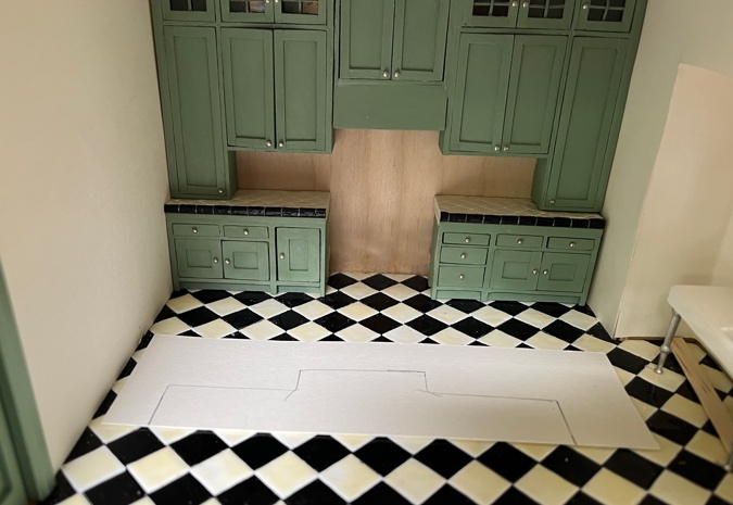
I laid the cabinets on a piece of scrapbook paper to trace the backsplash area.
Then I started gluing on the tiles.
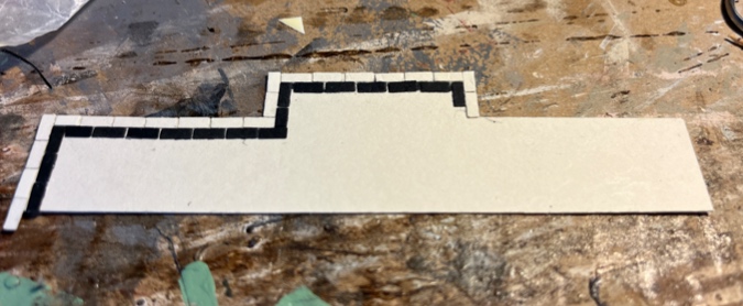
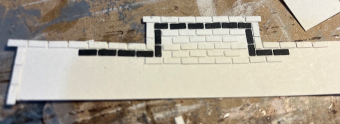
I didn’t like a few things about this first attempt. I thought I centered my initial tiles, but apparently not, because I ended up with a tiny piece of tile at the left side of the second row where there should have been a full tile. And the fourth row didn’t quite line up with the border, which would have caused too big a gap between that row and the next one.
It’s on the right track, but wanted to start over and do a neater job.
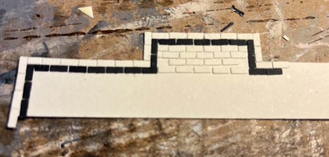
On the second attempt, I worked my way down to the bottom of the border first.
Then I worked my way back up, doing a better job with spacing between rows.
I did the same thing when I got to the bottom.
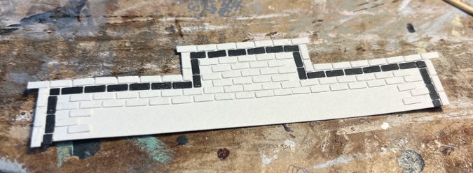
The tiles on the last row hung over the edge.
I used nail scissors to trim them to the edge of the template.
Okay, that was a mistake. Now there’s an ugly dark line along the bottom where the bottom of the template doesn’t quite meet the countertop. Rather than cutting them off there, I should have extended the tiles down below the counters for a neater transition.
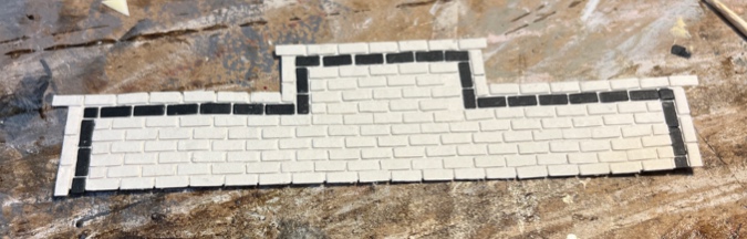
Maybe this was a case of staring at something up close for too long, but I also wasn’t happy with the overall look of the backsplash. At this point I could have added the Gallery Glass paint that will make these look less like paper and more like tile, to see if that helped, but I just felt like I wasn’t doing my best here.
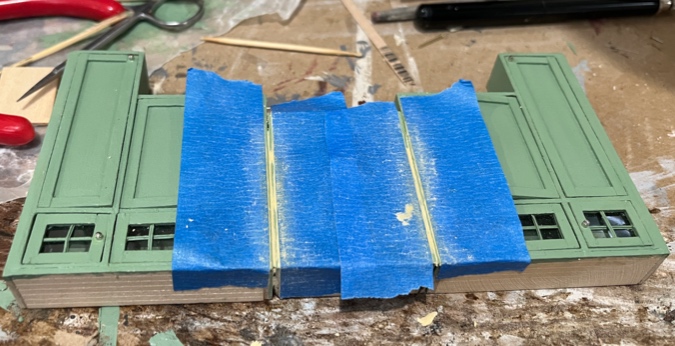
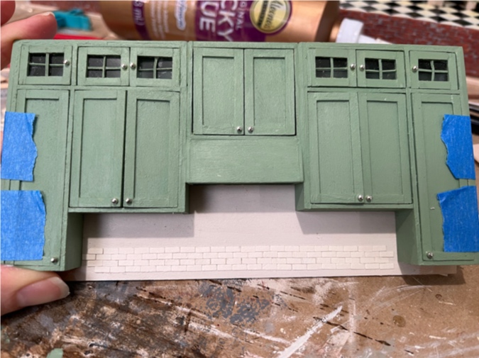
Third time’s a charm? Deciding that I needed a beefier backsplash, and that cutting a piece to fit exactly under these (imperfect) cabinets would be more trouble than it was worth, I prepared a piece of wood as wide as the cabinets, and slightly taller. This will extend slightly behind the lower cabinets, solving the seam issue.
For now I taped this to the cabinet assembly. I’ll glue on the tiles with the cabinets taped in place, so I can get them snug, but then will remove the cabinets to add the Gallery Glass and grout. Once everything is finished, I’ll glue the backsplash piece to the cabinets before sliding the uppers in place for the last time.
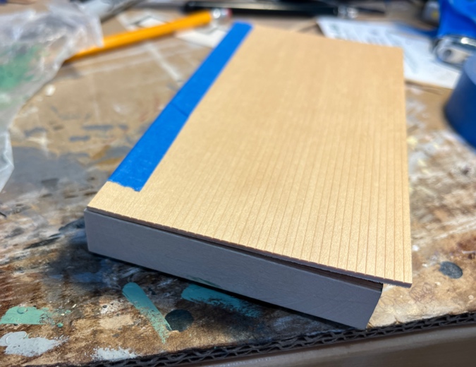
I started by painting the visible area with Behr Varnished Ivory. I then taped the wood to the cabinets and checked to make sure I would still be able to slide the cabinets in and out of the house once the backsplash piece was attached.
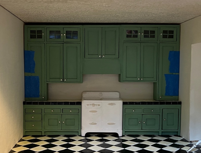
And I started gluing tiles again. They’re easier to slide around on the painted wood than they were on scrapbook paper, and to remove after the glue has dried. That’s a good thing, because when I got this far on the border, I popped it in place to see how it looked and… I really didn’t like it!
Now that the tiles are snug up to the bottom of the hood, the white row above the black row is almost impossible to see. I also just don’t like how this black border looks with the top of the stove. It’s too boxy. I got fixated on doing something like the inspiration picture, without pausing to really look at how it looked at the room.
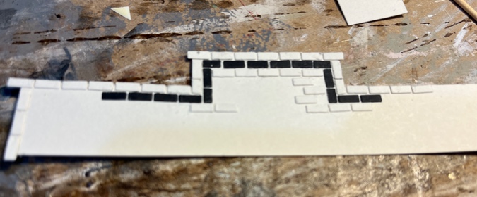
So… I started over again. I picked off the tiles I’d already glued on and this time started at the bottom, using a piece of scrap wood to line up the tiles with the bottoms of the tall cabinets (which sit on the countertop).
After doing the first row with the guide below it, I did another row under that to ensure a neat transition along the seam between the countertop and backsplash. Then I continued my way up.
In my previous attempts, I’d left a crack of space between each tile to serve as a grout line. This time I’m placing them right next to each other. I can keep the rows neater/straighter this way.
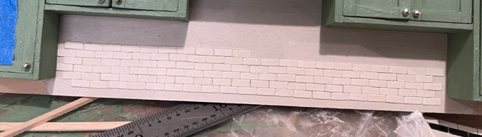
After several false starts, I’m feeling good about this! I hope to finish it next weekend.
 Emily is a freelance writer, miniaturist, and adventure game enthusiast.


Your work is inspirational, and it’s also encouraging to me that you share your trial-and-errors, as well as your success stories. Your patience is phenomenal!
Painstaking work, but it will look amazing! You definitely inspire me. Can’t wait to see progress.
I love how this kitchen is coming along! Wonderful work!