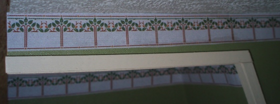
Since the Rosedale’s rooms have all sorts of wonky angles (some intentional and some a result of the bash) and since I really hate cutting crown molding, I decided to use wallpaper borders instead. I’m not entirely happy with the results. It was hard to get my hands into some of the tiny corners to glue the paper in straight, which sort of defeats the point. I might end up gluing a very small piece of wood trim to the top edges of the walls to make them look cleaner. But I’m getting ahead of myself!
The borders I’ve used so far are the Arts & Crafts designs from Brodnax Prints. There are five designs altogether. I want a unique design for each rooms so I’ll have to come up with another solution for the remaining three rooms.
I started with the master suite. In addition to the wallpaper borders, in this room I also had to add trim around the doorway that opens up onto the wing. I initially tried something simple.
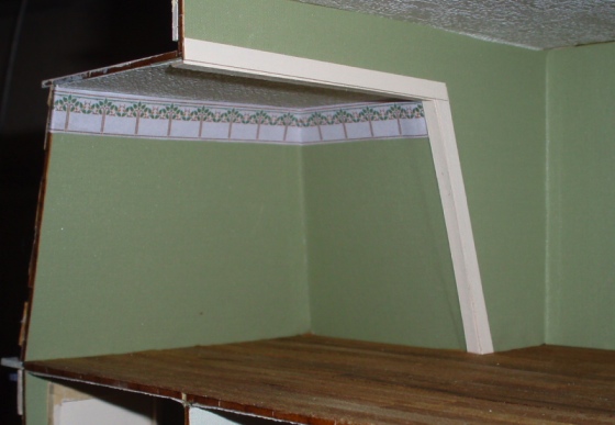
I liked the look of this, but as I got ready to add the border I realized that either the ceiling or the door is crooked, and it was going to look really obvious.
So I replaced the top with a larger piece of 1:12 door casing. It’s kind of ornate compared to the trim in the rest of the house, and you can still tell it’s crooked if you pay attention to the design, but it minimizes the problem. At least, that’s what I’m telling myself.
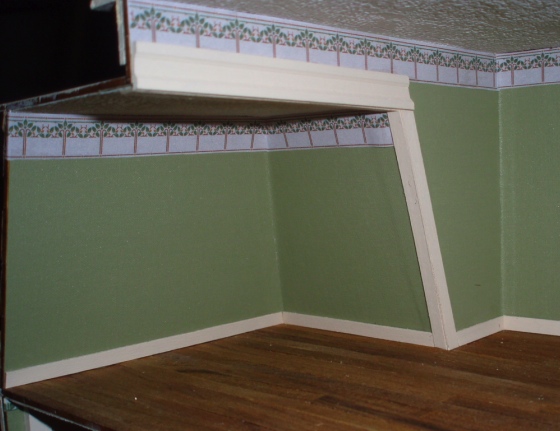
Here’s the master suite with the wallpaper border and baseboards in. For baseboards I used plain old strip wood. I came up with a new system to make the prep work go faster: I painted the entire 24-inch piece of strip wood, then cut the pieces. Less hassle than painting each small piece individually.
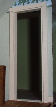
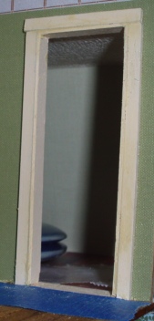
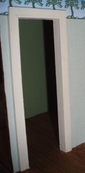
As I mentioned in my last blog, I didn’t like how the insides of the doorways turned out, so I added strip wood to make them look nicer. After gluing the wood to the inside edges, I filled the cracks with wood filler and carefully repainted the trim. The three pictures below show before wood filler, after wood filler, and after paint. (They’re three different doors, so it’s not exactly a progression.)
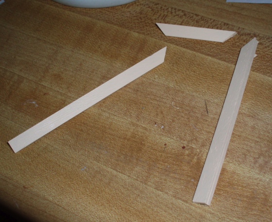
For the porch door, I needed to modify the trim that came with it since the door is wider than the wall it’s sitting in. This is easy to fix by adding shims to the inside edge of the trim. People ask about this a lot on Greenleaf’s forums so I took pictures to show how I did it.
First, here’s the door without trim.
When the trim is placed flush against the door, there’s a gap between the trim and the wall. This gap needs to be filled in with an additional piece of wood.
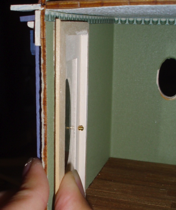
I cut a piece of strip wood to the correct size, with a 45-degree angle at the top to match the trim piece. Only the back edge of the shim will be visible, so this doesn’t need to be the same width as the trim piece.
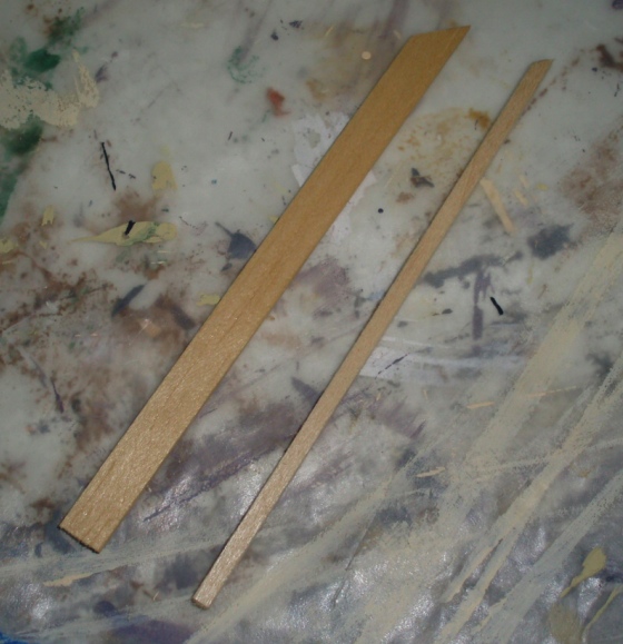
Glue the shim to the trim piece.
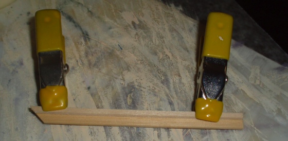
After gluing, you should have three pieces like this.
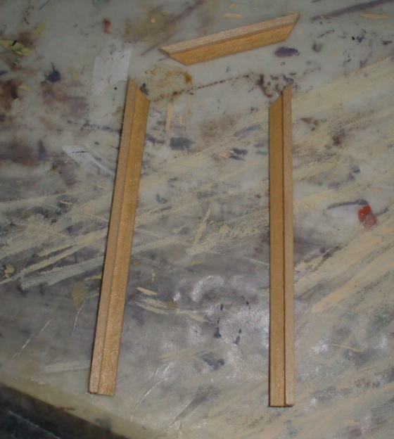
Paint the trim. Where the original trim piece and the shim meet, you should have a nice smooth edge. If not, you can sand it and/or use wood filler to make it more uniform. This edge will be visible, and at a glance you don’t want it to be obvious that you glued two pieces together.
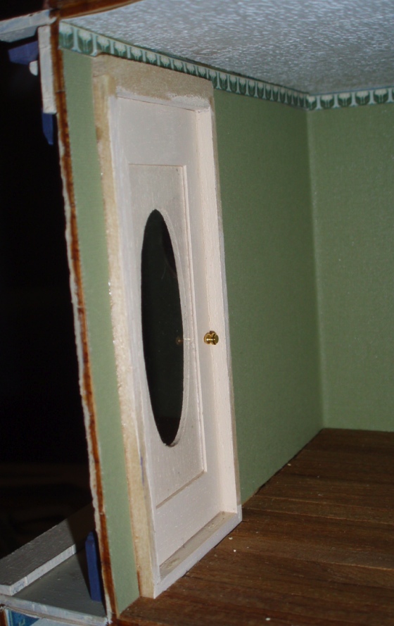
Glue trim onto the door. As you can see in the photo below this one, the door does protrude a bit more than the doors that came with the kit, but not unreasonably so.

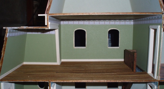
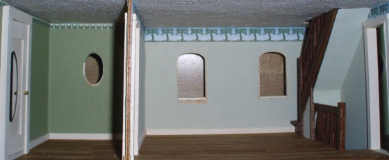
Here’s the second floor with wallpaper borders and baseboards in. The skinny little border in the room on the left was especially tough to get in and it’s not quite straight in the corner. It’s driving me crazy but I think trying to fix it would make it worse. (Famous last words.)
And working our way down, here’s the first floor.
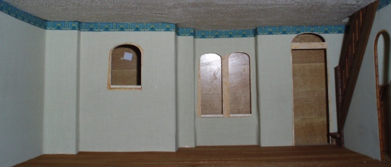
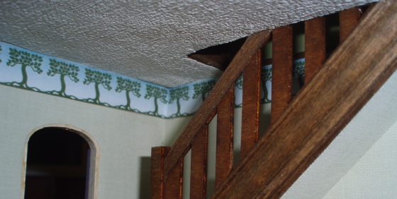
I can’t decide if the border should stop at the stair hole like I have it, or extend all the way across. On the second floor it extends across but there’s an obvious transition between two rooms with two different wall colors separated by a piece of trim. Here, the wallpaper doesn’t change and I like the smooth transition from first to second floor, without having it broken up by the border. But cutting off the border looks odd to me. Thoughts?
For a comparison, here’s how it looks on the second floor. (Best photo I could get of this angle!)
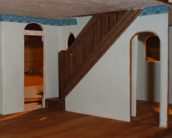
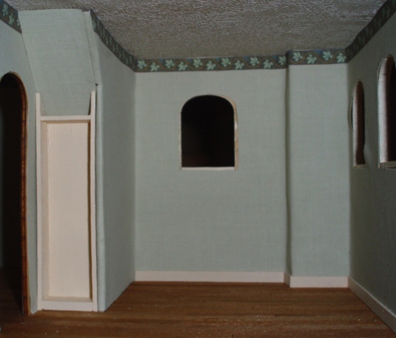
Here’s the laundry room with the border and some baseboards. I’m working on a cabinet to go under the stairs.
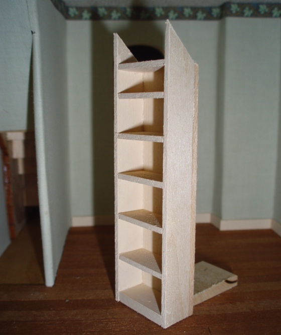
I made this as a standalone unit that slides into the empty space. The shelves aren’t glued in yet. Once it’s installed glued in, I’ll add trim around it to make it look like a built-in.
 Emily is a freelance writer, miniaturist, and adventure game enthusiast.


How about if instead of cutting the border square at that point, you cut it diagonally to match the angle of the stairs, as you did on the other side of the stairs? (Though it makes more logical sense on that side, it would be more decorative on this side.)
You could continue the border until it hits the stair (trim at the angle of the stair where it hits) and put a thin strip of trim at the top of the border. The trim could be stained the same as the stair and look like part of that assembly. From what I see in the pictures it could cover the visible edge of the floor above. The view of the border at the top of the second floor stair has that look.
In my first parenthetical “trim” means cut–not a piece of trim.