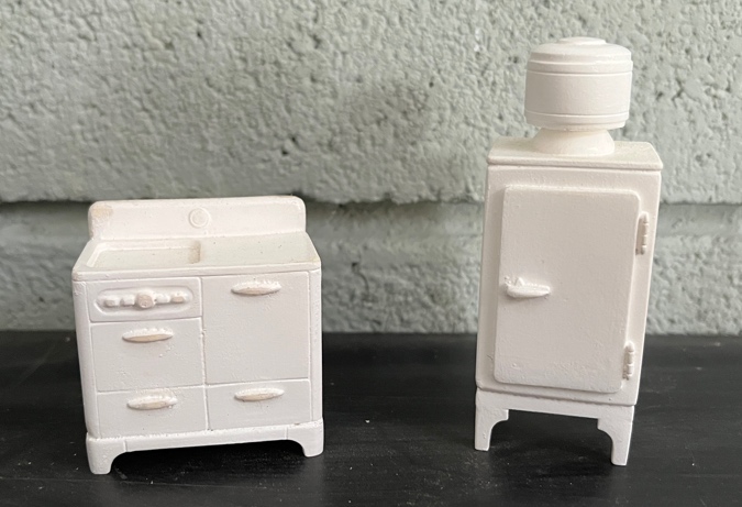
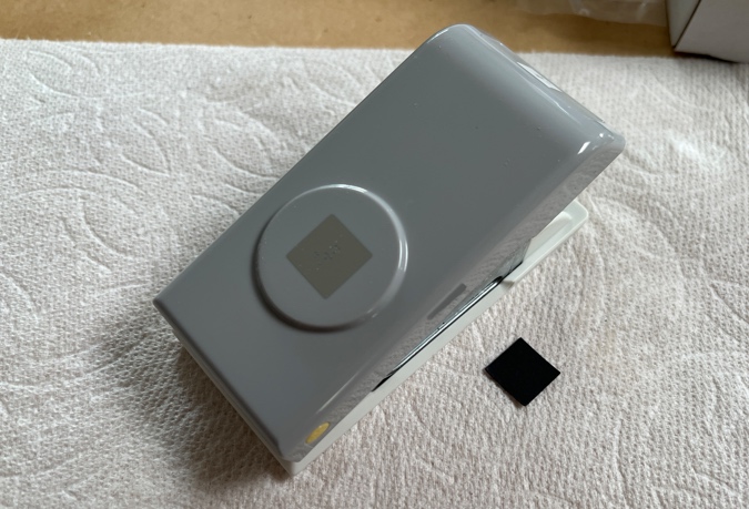
In my quest to furnish the Mansard Victorian (almost) entirely with Bauder-Pine and Cassidy Creations furniture, I plan to use these Cassidy Creations appliances in the kitchen.
When I first started thinking about this room — around a year ago, probably — I googled “1920s kitchen” and these pictures are the first two that turned up. (Photo source.) This is a modern kitchen renovated to look old, and it’s super cute.
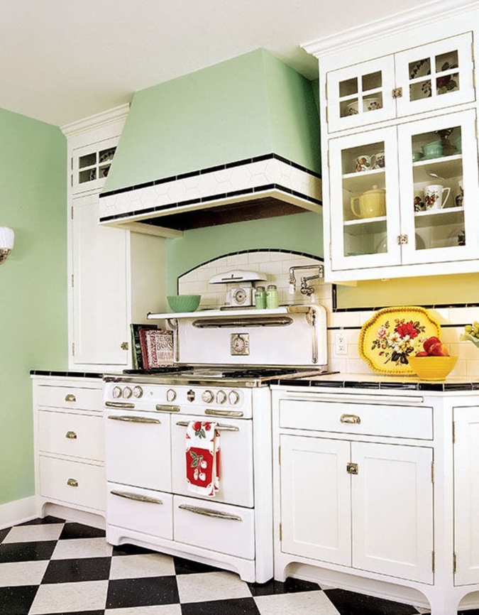
In fact, I think I found these pictures around the same time I decided to match the light green paint of the Bauder-Pine furniture and use it for trim throughout the house.
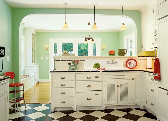
So that’s what I want to emulate in the Mansard Victorian’s kitchen, starting with the floor. I could have looked for a checkerboard floor or printed something out, but where’s the fun in that?
In the Victorianna, I made a kitchen backsplash out of tiny squares of scrapbook paper cut with a paper punch. I applied Crystal Clear Gallery Glass paint to each tile to give it shine and texture. (Read about it here.)
I liked how that turned out — so much that I did it again in the bathroom — but when I tested it out with larger squares to make floor tiles, it didn’t work as well. So I went to Michaels a couple weekends ago hoping to find something that would look tile-like without the Gallery Glass.
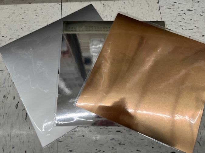
I spent a long time in the scrapbook paper aisle, getting distracted (quite literally!) by shiny things. Check out this metallic paper! The one on the left would be great for stainless steel, the one in the center is so shiny it’s mirror-like, and the copper one could maybe be used for a roof?
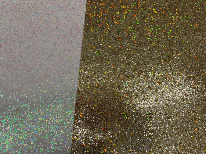
And these glitter papers look a lot like terrazzo, if I could figure out how to take away the shine. Matte sealer? A piece of thin tracing paper laid on top of it?
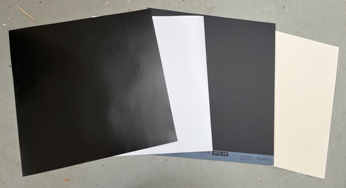
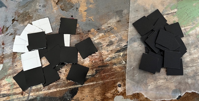
Okay, but shiny paper is not why I was at Michaels! I finally picked out some off-white and black paper that seemed like the best I was going to find. It was 80lb, which is stiff by scrapbook paper standards, but lacking the heft of a floor tile.
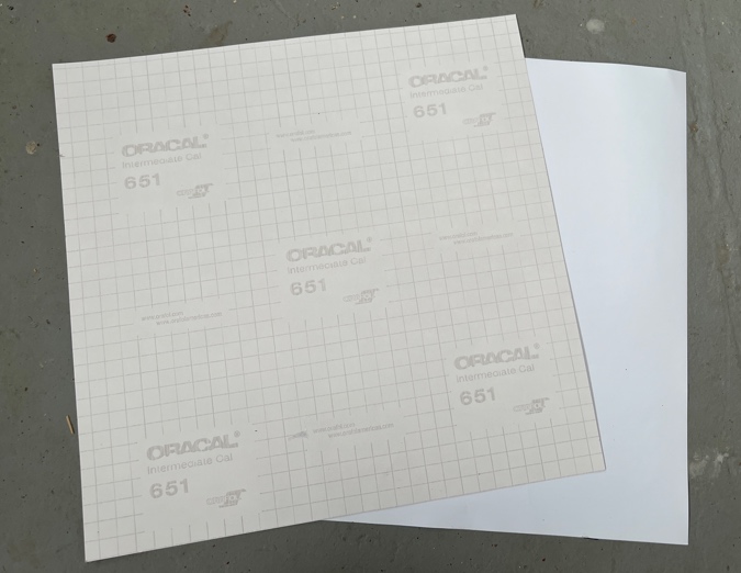
Then I wandered into the next aisle, where all the Cricut supplies were, and discovered a display of what looked like scrapbook paper but were in fact vinyl sheets. Here you can see the vinyl sheets on the left, and the scrapbook paper on the right.
In the store, the vinyl sheets seemed a little thicker than the 80lb scrapbook paper, but when I got them home I realized they’re actually very thin, sticky vinyl (like contact paper) on a removable backing. The backing has a grid on it, which in theory could be good for cutting tiles.
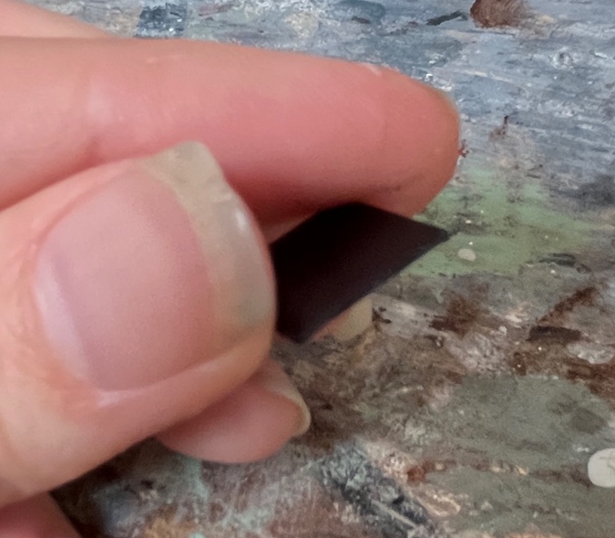
But I had another method in mind: a .5″ paper punch (equivalent to 12″ in 1:24 scale).
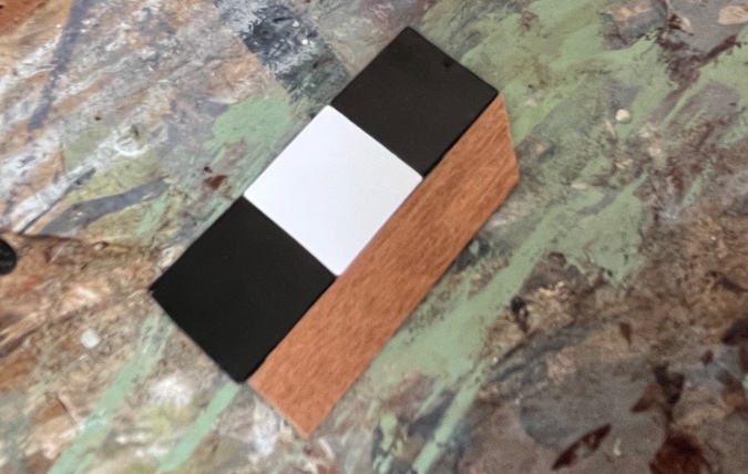
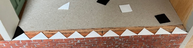
I wanted the tiles to be thick enough to (more or less) meet up with the threshold under the kitchen door. By itself, the vinyl isn’t thick enough, but by gluing a square of the vinyl to a square of the scrapbook paper, I can make a tile that’s almost the same height as the hardwood.
These meet up nicely.
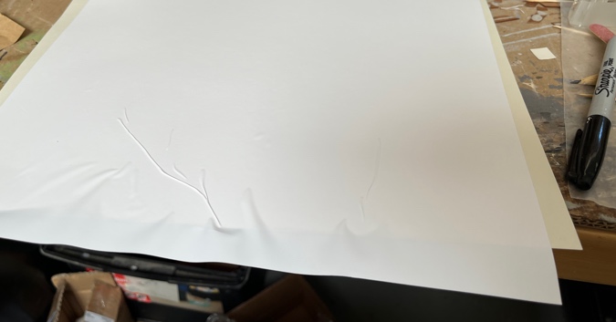
But gluing squares together seemed like a lot of extra work. What if I just peeled off the vinyl and stuck it down on the scrapbook paper?
First of all, I can never do this sort of thing without making a wrinkly mess, and I should have known better.
And second of all, now a tile isn’t not thick enough to meet up with the hardwood. Honestly that’s not a big deal, but I liked my prototype two-layer tiles better. I put the vinyl-stuck-to-scrapbook-paper aside for another time and continued with the first method.
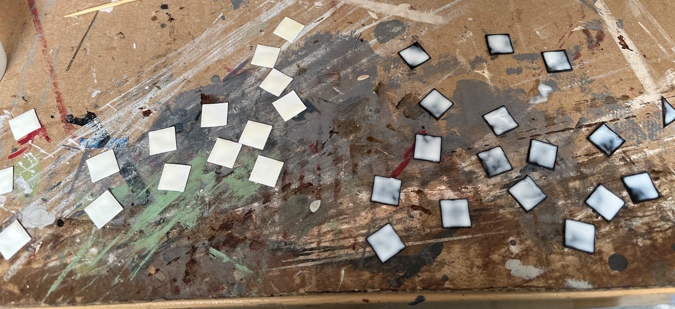
Apparently one edge of my square punch is dull (in spite of being brand new), because one side of the squares comes out ragged.
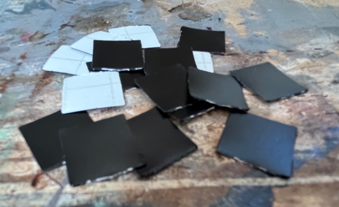
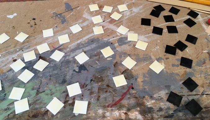
After gluing a vinyl square to a scrapbook paper square, I carefully trimmed off the ragged part with nail scissors. Then I went around the edge with a black Sharpie to cover the white edges that showed. (On the white tiles I just did the trimming part, obviously.)
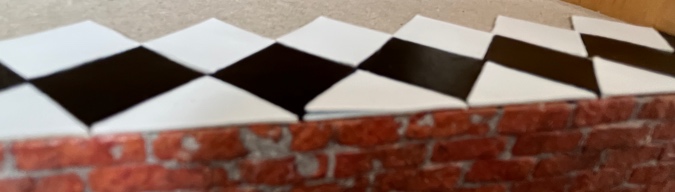
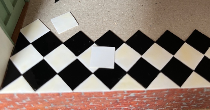
Hey! That really looks like a vinyl floor!
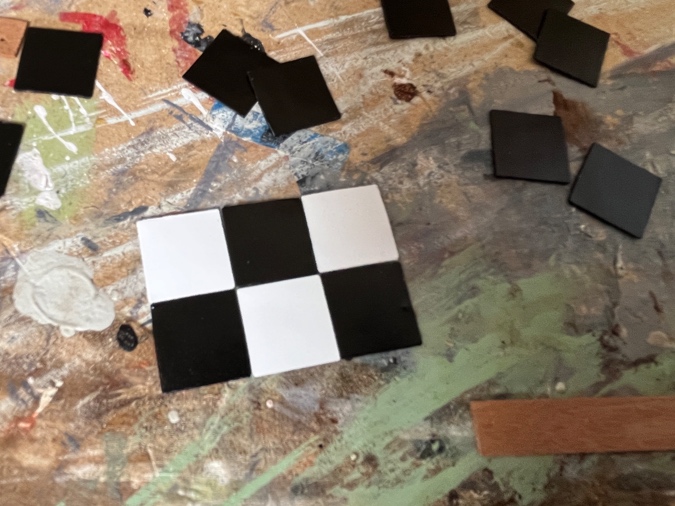
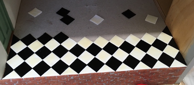
I started tiling at the front of the room — this way if there’s a row of partial tiles at the end it will be covered up by the cabinets and appliances. I marked the center of the floor and laid out the first row so two tiles would meet in the center. This would have allowed me to trim the tiles at the edges and keep everything symmetrical, but they turned out to fit perfectly without needing to be trimmed.
As I glued them down, the vinyl pulled up from the backing on a few of them. Uh-oh. I glued the loose corners back down with tacky glue and hoped for the best.
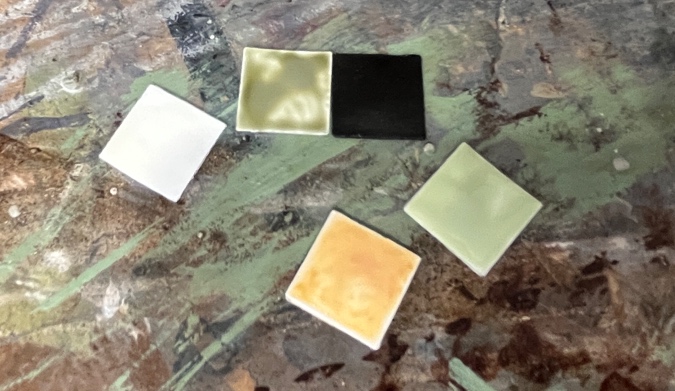
A few rows in, I was liking how the checkerboard was turning out, but the white seemed too stark. I worried that the black-and-white color scheme would be too different from the green and complementary pastels I’m using in the rest of the house.
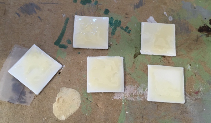
So I started experimenting with Gallery Glass after all. It’s hard to tell in the picture, but the tile on the left is covered with Cameo Ivory, which is a yellowy off-white. I also tried a couple greens and an orange to see if they looked any good against the green trim color.
While I was waiting for those to dry, I coated all of the black tiles I’d already glued down with clear Gallery Glass. I’m sorry to lose the vinyl look, but the vinyl is matte, and all the tiles should have the same sheen.
For the white ones, I decided to go with the Cameo Ivory. Here it’s been spread on the white tiles, and Crystal Clear on the black tiles (it dries clear). I did this by squirting a few drops of paint on the tile and then carefully spreading it to the edges with a toothpick. It was challenging not to drag my hand in the tiles I’d already painted, and I did accidentally bump a few of them, requiring touch-ups.
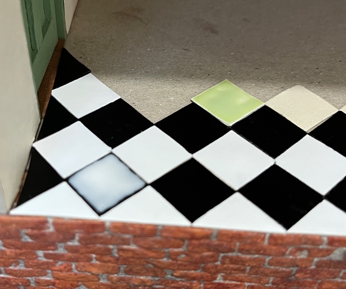
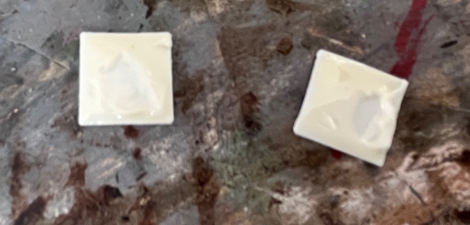
Here’s how it looked after the paint dried, with a white tile on top to show the contrast. The first coat of Cameo Ivory definitely helps to mute the stark white, but I decided to do a second coat to yellow them even more.
I knew that if I continued to glue in the tiles before painting them, it would be hard not to smear paint all over the place, so I painted the next batch of tiles before gluing them in.
Here you can see the difference between one coat of Cameo Ivory (on the left) and two coats (in the center).
I waited a couple of hours before attempting the second coat, but some were still tacky and the toothpick tore up the first coat. It’s possible the paint doesn’t stick to the vinyl as well as it does to paper.
Here’s how those lumpy ones look when they’re dry. They feel smooth, but the color is inconsistent. I’ll save these for the back of the kitchen where you can’t see them.
After messing up several tiles by trying to add the second coat before they were ready, and then messing up several more by accidentally brushing them with my hand while they were wet, I’ve decided that the process for these needs to be: make tiles, paint tiles, LEAVE THEM ALONE FOR AN ENTIRE DAY, then paint the second coat of ivory and leave them alone for another day. *Then* I can glue them in.
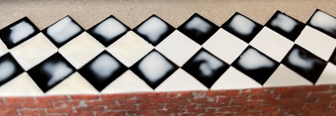
So I haven’t actually glued any more in — the last row and a half of these are just sitting there to see how they look. Even though I added a second coat of ivory to the ones that are glued in, the new ones seem darker. (Also, the camera isn’t representing these exactly how they are in real life.) Hopefully once I get them all in the variation will be subtle, and then I can still do touch-ups here and there if I need to.
 Emily is a freelance writer, miniaturist, and adventure game enthusiast.


Thanks again for sharing your experiments/challenges/projects and for not being reluctant to share what didn’t work, as well as what DID! Your patience and skills are amazing!
They are really coming out great. Your patience is inspiring. I love the 1920’s kitchen so much! My mother had that stove. I had one made in mini years ago , in yellow like my moms was.
Patiently taking your time to colour the white squares to make them the shade you are looking for is inspirational. Hope you are very pleased with the lovely results…the kitchen is going to be a beautiful room in a well done miniature home!
The trick to avoiding a wrinkly mess is to leave the backing in place as long as possible. Start by peeling a corner or edge, folding the backing back and get the piece lined up perfectly, then press it down. Work the backing off slowly by pulling it from inside the “sandwich” smoothing the surface as you go. With the backing in place the overlay will tend not to wrinkle and if the overlay is flexible and the backing not too thin you can actually push the backing off through the bend at the top surface. Using a squeegee lightly there can also help smoothing a straight line. (A picture might be better than the above “thousand words” but I don’t have one at hand.)
I always pull it off all at once and it never works out, you’d think I would learn! I’ll try this method next time. I think I am going to stick the vinyl to the scrapbook paper when I do subway tiles for the backsplash.
Your tile floor is looking amazing! Making individual tiles gives it such an authentic look. I love reading about your process, what went wrong, and how you fixed it. As for the bubbles in the sticky contact paper….it makes me so happy to know that I’m not the only one this happens to!